2022&2023, TOP STORES IN NET SALES
This column chart visualization (Appendix A.1) represents the three stores that have achieved the highest net sales in 2021 and 2022. As each city has only one store, the stores have been identified with their city names for clear recognition And The X axis shows the year, and the Y axis shows the net value. The names of the cities are in the legend.
Analysis
Our main goal from this analysis is to find the top stores by net value in 2021 and 2022. Each year, the top standing stores are completely different. Thus, we have six stores in this visualization. In 2021 the least net sales among the top 3 stores was just below 295k, while in 2022, the least was nearly 290K. Although 2022 was not a bad business year for all the stores, the top net sales by a singular store were recorded over 305k, just over 6k more than the top net sales for 2021 (Figure 1.1).
In 2021, the top 3 stores were Canberra, Toowoomba, and Launceston respectively. All 3 of the stores crossed a 290K margin of net sales. The net sales are around 294k, 299k, and 302k, respectively with Launceston having the most sales of the year.
But in 2022, we find ourselves with three new score leaders: Melton, Cranbourne, and Bunbury. The top stores crossed the 285k margin. Cranbourne and Melton had net sales around 284k, whereas Bunbury had over 308k of net sales.
however there is little difference of the total net sales (Figure 1.2) between the years of 2021 and 2022. 2022 had slightly more net sales. The top 3 stores of Both the years show unique results. It can be said for sure that Bunbury store had great success in the matter of net sales as they crossed the last year margin and also created a good gap for the other stores.
Assumptions
- There is only one store in each city so that the stores can be identified by their city names.
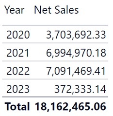
- The order date data has been chosen for the net sales timeframe. We consider a product discount and selling prices before the order taking place. So once the order has been placed, it’s safe to assume as a part of Net Sales.
PART B – Question2
Months where a Product in any of the states is Higher than usual
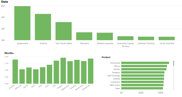
Figure 2.1
At a glance, there are three types of data. The State column chart shows the total sales in each state, the months column chart shows the total sales in different months, and the product bar chart shows the top products’ total sales. The X-axis of the Month and State chart has the Month and state name. While the product charts Y-axis shows the top product names. The X-axis of the product chart and the Y-axis of the month and state chart represents total sales. All the charts are cooperative with each other and work as filters for each other.
In this base state, we can see Queensland has the most total sales. The months where the most sales happen are January, August and December. Also, some of the most sold products are dinnerware, pillows, vanities, pendants, and wall coverings.
For this analysis looking through the minor changes in places or total sales between the states in different months proved to be crucial. Going into further details with those mere speculations, unusual sales were noticeable in different months in different states. Some of the findings have been noted down below.
- Victoria’s March: Victoria state has the highest sales of Wall coverings all over Australia. In march, they have the highest sales of this product. Around $25k till now only sold in that month (Figure 2.2).
- Bar tools in Victoria: The selling of Bar tools spiked
- in January more than ever in this state. Around $26k till this date.
(Figure 2.3)
- Tasmania’s April, May and July: In April, Pillows are highly sold in Tasmania, selling over $9K in total (Figure 2.4). And in May, around $12k worth of Basketballs Have been sold(Figure 2.5). In July, there is another noticeable spike in the Vases, around $11k of total sales, which is twice than of any other time of the year (Figure 2.7).
- Australian capital territory: At that time of the month more sales of Steam ware are sold in this state. More than $10K Have been sold to date (Figure 2.6).
- Dinnerware in Tasmania: This product is not one of the most sales-gaining product. But in the month of September, an increase in its sales is noticeable (Figure 2.8).
- October: This time of the month, ornaments are sold more than ever In Queensland and Western Australia. In fact, it’s the most sold Item for WA in that month (Figure 2.9).
- Queensland November: Table Liners (Figure 2.10) and Clocks (Figure 2.11) are the most bought items in this state in the month of November. This type of sales is not seen in any other months.
Coming to a conclusion depending on different culture or occasions, the buying habits of the states differ in some particular products. Some of the products in this analysis are hardly sold for the rest of the months, but suddenly get sold a lot in a particular state at a particular time. This intel can be very important and valuable if used correctly. The corporation can strategize their sales, stocks, and marketing of specific products in specific locations through this analysis.
PART B – Question 3
TOP 10 Teams in Profit
The bar chart represents the top 10 Teams who have achieved the highest profits amongst the 28 teams. The X-axis represent the amount of profit generated during the selected period, and the Y-axis represents the teams. Our goal is to identify the teams that have generated the most value.
Analysis
Throughout the records available of the years 2020, 2021 and 2022, we can see that Team Todd Robertson has generated the most profit for the corporation, over 275k. Following Team Todd Robertson 4 other teams have generated between 265k and 275k.
In the year of 2020, the leading team was Team Adam Hernandez, by generating profit of nearly 80k. The other teams also generating near 70k were Team Carl Nguyen and Team Antony Torres. Todd Robertson generated around 60k that year (Figure 3.2).
But in 2021 Team Todd Robertson generated most profit, about 112k. Following Team Todd were Team Nicholas Cunningham, Roy Rice and George Lewis, Carl Nguyen, Donald Reynolds, Roger Alexander, Samuel Flower, all generating above 100K Profit. (Figure 3.3).
In the Year 2022 three teams came up to in the leader board who weren’t in the top 10’s list in the past 2 years. Team Shawn Cook, being the top Team, gained profit of over 127k, which is the highest recorded profit gained by a single team in a single year. Following Team Shawn were Patrick Graham and Antony Berry both generating nearly 108k profit in that year (Figure 3.4).
Through the ups and downs of the years team Todd Robertson, Roy Rice, George Lewis, Carl Nguyen, and Shawn Cook have generated more than 265k in the three years. Although these teams have not always caught up to the Yearly leader boards, through consistency, they have been the teams who have been the most profit generating teams in the Sales department.
PART B – Question 4
Unfortunate Warehouses to be Shut Down.
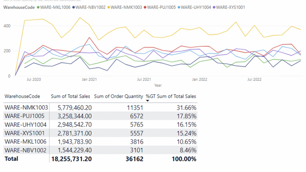
The Line chart represents The progress of 6 warehouses throughout July 2020 to July 2022. The X-axis indicates the time, Y-axis Indicates the Total orders prepared by each warehouse Each Period. The legend shows each warehouse, which we can see as the lines. The table below shows us an accurate amount of total orders and total sales resulting from the orders and the percentage of their contribution. There are six warehouses total in the business which deliver the products all over to our customers. In need of terminating two warehouses, the visualization helps us with the decision.
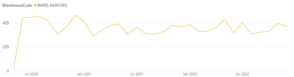
To begin with, all the warehouses seem to have quite a steady pattern of their capability. The number of orders or total sales is not seen fluctuating much. Warehouse WARE-NMK1003 Produces most orders which are coming from all the stores, thus generating the most sales. It has generated 1131 orders, which resulted in $5,779,460.20 in sales till now.
The next 3 WARE-PUJ1005, WAREUHY1004, and WARE-XYS1001 have Interchanged their produce from time to time. They have very similar progress by a near margin. Till now, they have generated 5500-6500 products and resulted in $2,780,000-$3,259,000 of sales (Figure 4.2).
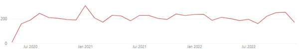
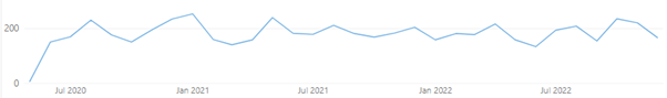
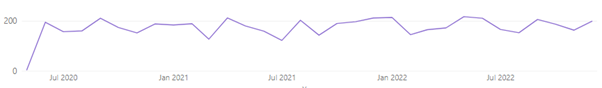
Figure 4.2
The Bottom 2 warehouses, WARE-MKL1006 and WARE-NBV1002, are not performing as well as the other warehouses. They have contributed only 8.46% and 10.65% in sales for the company. Their Progress has been low in the matter of production and sales. Both have generated 3816 and 3101 quantities of products, resulting in 1,943,783.90 and 1,544,299.40 of sales, respectively. (Figure 4.3).
Figure 4.3
In conclusion, In need of closing down 2 Warehouses, WARE-MKL1006 and WARE-NBV1002 are nominated in the reason of their lower sales and order generation in comparison to the other warehouses.
Assumptions
- All the warehouses can supply products to all the stores. So in case of closing one wouldn’t harm the stores much.
- All the warehouses can produce every product necessary. So, closing a warehouse will influence product production.
- Use shipment date in order to track progress, as after a product is shipped from the warehouse, it should be counted as complete.
PART B – Question 5
Do cities with Higher Populations mean Higher Profits?
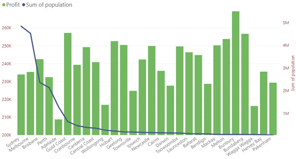
Figure 5.1
The column chart represents an analysis of the population and the profit. The X-axis represents the names of the cities, the Left Y-axis shows the profit by thousands, and the Right Y-axis shows the population by millions. Profit is represented by the green columns, while the population is represented by the dark blue line. The chart has been sorted by highest population cities from the left to lowest population on the right. All the shops in those cities have profited more than 200K.
The visual is quite self-explanatory as we see a sudden population drop on the line, but the profit columns remain steady and, at some point, the highest. Going into further details, Sydney is the most populated city, with 4,840,600 in this data set, and Pakenham,46,421, the least. In the case of profit, Adelaide seems to be the least profitable city, at $208,744, whereas Bunbury is the most, at $ 269,275.
The most populated states are looking less profitable. In reference to this statement, a few comparisons have been provided.
- Harvey Bay and Sydney are similar in profit. However, Harvey Bay has a population 88 times smaller than Sydney. In fact, Harvey Bay has profited almost $2000 more. The least populated City, Pakenham, Profits almost the same as the 4th most populated city, Perth, Which is 46 times bigger in population.
Bunbury, the city with the most profit, comes 24th in 28 cities listed based on Population.
The analysis shows that the states with higher populations don’t mean higher profits. The reasons behind this could be a competitive market and customer loyalty. As the cities get bigger, competition gets higher. In small cities, its easier to gain customer loyalty because of low competitors. To conclude, bigger cities might have bigger audiences and opportunities but bring in tough competition as well.
PART C
Data Transformation Process
- Total sales. It was an essential part of this analysis. To get this value, I simply created a new column in data transformation mode with
Total Sales = [Order Quantity]*[Item Price]
Here, Total sales is the column name. We previously had Order quantity and Item price in the Sales Data. So, by multiplying Order quantity by Item Price, we got the total sales for each sales record. This got me the total sales or total gross sales.
- Discount band value: The discount band was given in words but not in values. This was essential to get Net Sales as Net sales= total gross sales – Discount. I used a DAX function to determine the value of each of the discount bands.
Discount Band = DATATABLE (
“Discount Band”, STRING,
“Discount Percentage”, DOUBLE,
{
{“NIL”, 0.00},
{ “LOW”, 0.01 },
{ “MID”, 0.02 },
{ “HI”, 0.05 }
}
)
Here, Discount Band is the Measures name. DATA TABLE signals the software that I am going to create a table. The “Discount Band” and “Discount Percentage” are the column names. String refers to a data type used to represent text, and Double represents Numeric Values. LOW MID and HI are the given Discount bands, and beside them are the values that have been put in decimal points to calculate percentages. This gives me the discount values.
- Total Discount: Now that we have created the table, we need to link it to the sales data table so the discounts on each record can be calculated. The measure used in this is
Total Discount = SUMX(‘Sales Data’, ‘Sales Data'[Total Sales] * ( RELATED(‘Discount Band'[Discount Percentage])))
Here, for the total Discount, I use a SUMX, which is used to calculate through each row of a specified table. Then, we write down or select the rows and the formula. I take Total sales from Sales Data. Now, Sales data has a Discount band column with no numerical values, but our discount band table, which we created with DAX, has the values. I use a RELATED function to relate the Discount band from the Sales Table to the Discount Percentage of our Discount band Table created using DAX. Then, I perform a multiplication between total sales and our new formula to relate discount percentages. This gives us the total amount of discount for each record.
- Net Sales: Net sales were needed for the analysis of questions 1 and 3. To get this Value, I used another measure to subtract the discounted amount from the total sales we previously got. The function was
Net Sales = SUMX(‘Sales Data’, ‘Sales Data'[Total Sales]) – ‘Sales Data'[Total Discount]
Here, we again use a SUMX. Then, we select the rows we want to perform the formula on. For the rows, I typed in total sales from Sales Data and deducted the Total discount we measured earlier. That gets us Net sales.
- Profit: To get profit, I needed
- Net sales, which we just measured
- Sales cost, which is given in the sales data.
So now simply we again create a new measure to get out profit. We take Net sales, we take Sales cost, we Deduct the sales cost from the Net sales, and we get our profit.
Profit = [Net Sales]- SUM(‘Sales Data'[Sale Cost])
Here, we use SUM to get the total sales cost because
SUM is used for basic calculations in a table.
And with that, we have all the data necessary to do all five analyses for this project.